project
6Client
Earth in Color
Category
Environment and Lifestyle
Project Type
Brand Identity / Digital Design / Website Design
Agency:
Tiana Gidley Creative
Developer:
Victor Larodiel
Images:
Earth in Color / Pexels
Overview
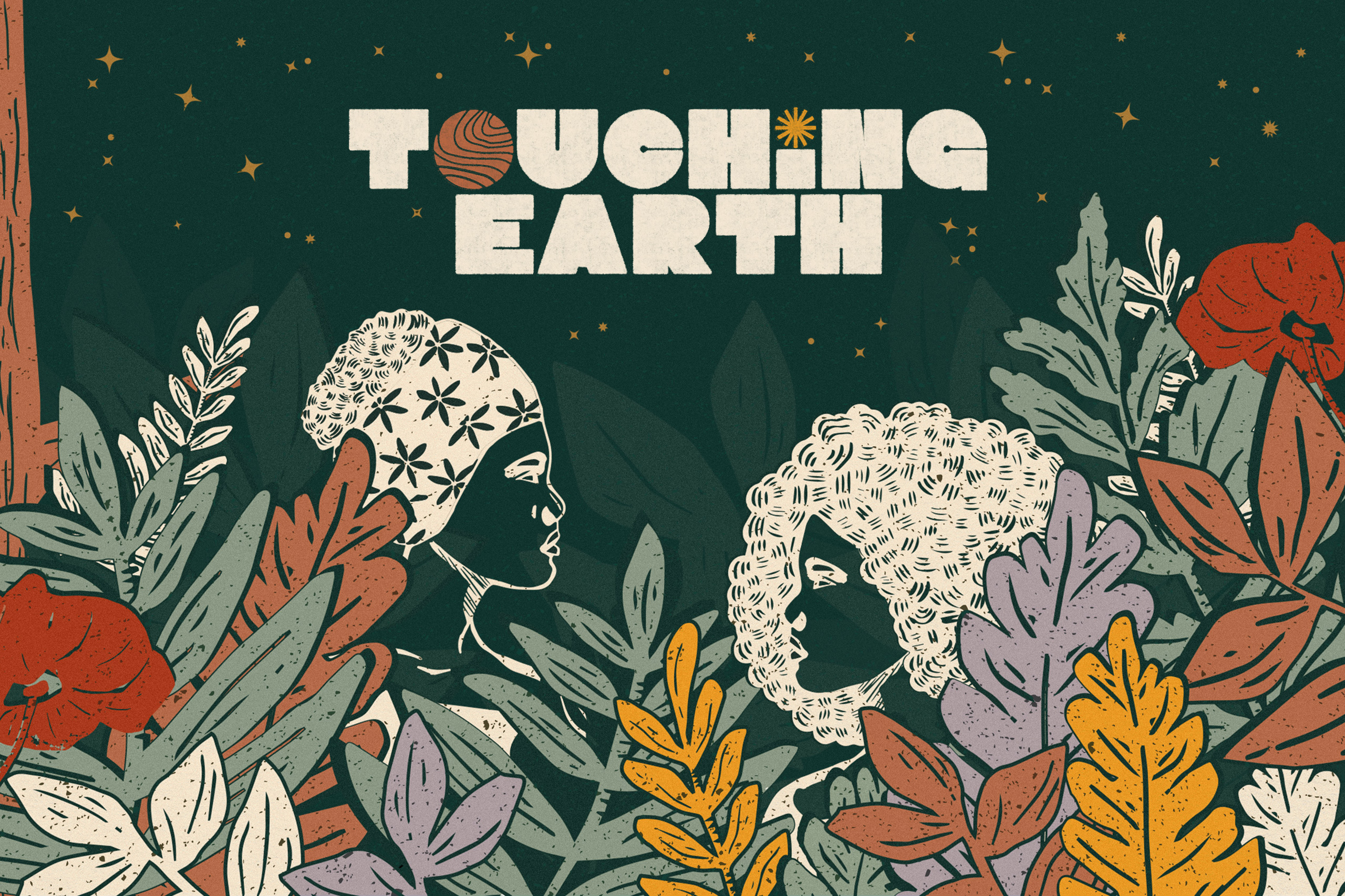
Brand Identity and Website redesign for Earth in Color — a creative studio and media platform telling stories, sharing recipes, and curating experiences to support our collective healing and that of the natural world.
Behind the Logo
The full lockup version is playful and cultural. The “O” in color and the submark is a subtle nod to Earth — inspired by topographic maps combined with a globe, the mark represents Earth’s thumbprint, symbolizing the unique melding of identities and histories that makes up the fabric of the Black community, and thus the fabric of our world.
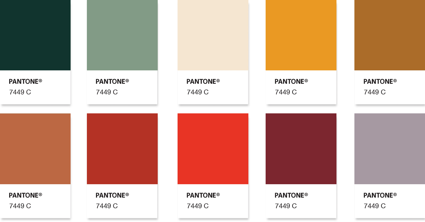
Color Palette
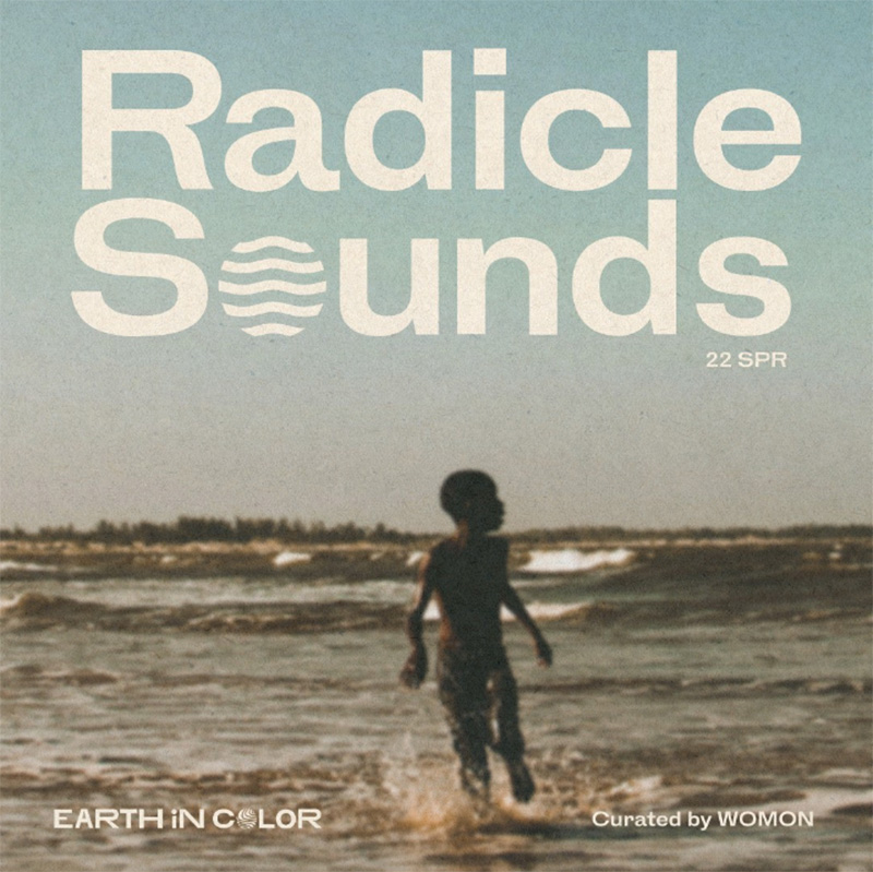
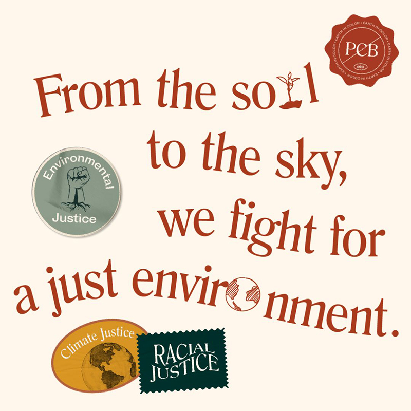
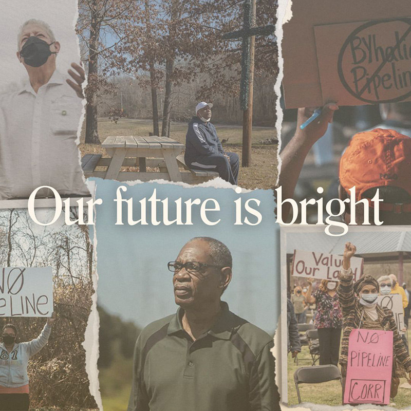
Instagram Application
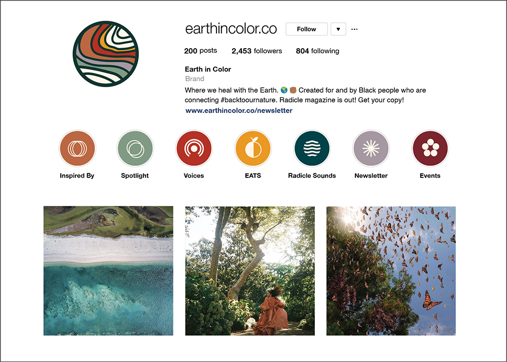
Instagram


IMAGERY DISCLAIMER 
I do not own the rights nor property of all images. They are solely used as part of my design process and all image credit goes to the source